Exhibit Design with Free Open Source Tools
Modern exhibit design relies heavily on digital tools. Unfortunately, the best known proprietary design apps entail costly subscriptions and lock users into workflows dictated by corporate software vendors. Free Open Source Software (FOSS) can give public historians and museum specialists more creative freedom in designing multimedia exhibits, eliminate recurring subscription fees, and build solidarity between museum educators and non-profit, community-driven software projects.
In 2021, we (Joshua Wachuta and Rachel Lewis) used exclusively Free Open Source Software to design interpretive exhibit panels, maps, and a touchscreen audio player for a small history exhibit at the newly restored St. Germain dit Gauthier / Coorough House in Prairie du Chien, Wisconsin. The tools we used covered a wide range of use-cases and skill-levels, ranging from simple GUI-based design apps to advanced programming tools for data visualization and app development.
Exhibit Setting and Historic Context
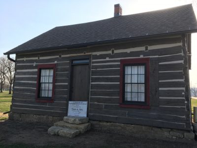
The St. Germain dit Gauthier / Coorough House dates to the early nineteenth century. It is the only surviving French-Canadian log house in the original “Main Village” of Prairie du Chien.
Located along the Upper Mississippi River, Prairie du Chien developed as a meeting ground in the fur trade, where Meskwaki, Sauk, Dakota, Ho-Chunk, Menominee, and other Indigenous nations met and negotiated with French-Canadian and British traders. Little of this multicultural history remains in the current built environment. In the 1860s, the arrival of the railroad led to a flurry of industrial redevelopment along the waterfront, which became known as the “Fourth Ward” after 1872. A century later in the 1960s, repeated flooding on the Mississippi River led to a full-scale relocation of the Fourth Ward community between 1978-1984. Most structures were either relocated or demolished, leaving only a handful of historic buildings behind in the floodplain.
The St. Germain House was spared from demolition owing to its unique log construction, but it sat idle for the next three decades. In 2018, the Prairie du Chien Historical Society acquired the house for preservation and oversaw its restoration, opening it for tours beginning in 2021.
The Prairie du Chien Historical Society restored the original log section of the St. Germain dit Gauthier House to its appearance in c. 1840, using period furnishings. Our exhibit occupies a one-room addition to the house built in the 20th century. The interpretive materials we created for this room share the history of the former Main Village / Fourth Ward community, helping to situate the house in its historic context.
QGIS: Historic Map Design
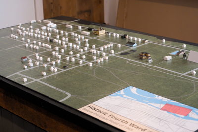
The neighborhood surrounding the St. Germain House was devastated by floods in the late 20th century, and little of the former built environment remains. To illustrate the historic context of the house, we designed a large tabletop map as the centerpiece of the exhibit. Local artist Keli Taylor created detailed miniature replicas of the handful of historic buildings from the Fourth Ward that still stand, while we represented the hundreds of structures that no longer exist with white, wooden “game board” style houses, indicating the extent of the neighborhood that was lost after the record 1965 flood and subsequent community relocation.
To create an accurate map of the community as it existed in the 1960s, we turned to QGIS, a free open source Geographic Information System application. QGIS allowed us to georeference historic plat maps, lot boundaries, and aerial photographs to accurately locate over 120 former homes and businesses that stood in Prairie du Chien’s “Main Village” / Fourth Ward area prior to the 1970s Army Corps of Engineers relocation program. Using the design and formatting tools in QGIS, we were able to shape this data into an high-quality map to print as the tabletop for our exhibit while maintaining an exact 1:800 miniature scale.
QGIS is a complex application supporting a huge range of professional GIS functionality. This entails a steep learning curve, but thankfully, the QGIS website provides extensive, up-to-date documentation on how to get started, including A Gentle Introduction to GIS with information on finding geographic data sources and understanding basic concepts for map creation.
Scribus: Interpretive Panel Design
To design the remaining interpretive panels in the exhibit, we turned to Scribus, an open source desktop publishing program created by volunteer developers. Scribus is a powerful application that allows for fine-grained layout of text and images, as well as precise color management. It is one of the only free open source programs able to produce graphics and PDFs to match commercial printing specifications, including CMYK color definitions and custom margin, bleed, and crop marks.
Unfortunately, of all the applications we used for this exhibit, Scribus also had the most dated interface, with options scattered across many different windows and menus. The Scribus Wiki contains much valuable information, but it is also not always as complete or up-to-date as the documentation for other projects. For new users, perhaps the biggest challenge is that while Scribus provides nearly infinite flexibility in document design, it does not offer any built-in helpers or guardrails to ensure that a document follows professional design standards. A helpful resource for using Scribus successfully is Kathy Reid’s “Professional quality layout design with Scribus,” a 100-minute tutorial recorded at linux.conf.au in 2020.
Despite the complex interface, Scribus impressed us with its power to shape text layout, align document elements, and manage color palettes. Using this tool, we were able to create a consistent visual style for all the exhibit panels at the St. Germain House, and Scribus exported our designs as PDFs ready for professional printing.
Blender: 3D Graphics
Blender is a free open source 3D computer graphics creation suite sponsored by the non-profit Blender Foundation. The software is popular with both professional and hobbyist 3D artists, who use it to create art and animations for films, video games, and other multimedia. For museum experience designers, Blender offers an incredible range of potential uses, even up to the creation of fully immersive 3D representations of historic environments. For the purposes of the St. Germain dit Gauthier Exhibit, however, we used Blender in much simpler ways.
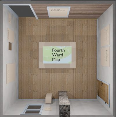
First, although Blender is not a CAD or architectural drafting program, it is quite capable of creating architectural visualizations using precise real-world measurements. This allowed us to use Blender to create a digital visualization of our exhibit space — including doors, windows, outlets, and other details — to help us plan the size and layout of the exhibit contents. Although measuring the exhibit space and recreating its dimensions in Blender took some time at the outset, the result was an accurate digital sandbox that allowed us to test furniture arrangements and size interpretive panels even before the interior restoration of the real life space was complete.
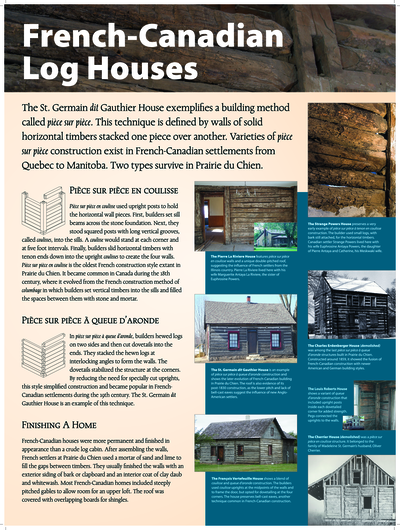
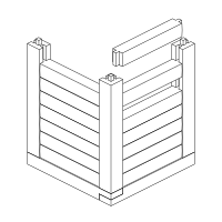
Second, as we turned our attention to the contents of the exhibit, we utilized Blender to design some of the illustrations for our exhibit panel. For example, this isometric diagram of French-Canadian log construction techniques (right) was very simple to create using a handful of 3D shapes in Blender.
Like the other software listed here, Blender is a complex package with a heavy learning curve, but the large community of Blender enthusiasts online makes it easy to find tutorials and learning resources. As a 3D graphics application, Blender also has higher system requirements than most of the other applications we used. Thankfully, Blender is undergoing rapid development, which continues to streamline the interface and optimize hardware use.
R: Data Visualization
Most of the St. Germain House exhibit consisted of text, images, and maps, but we also needed to include a large graph showing the history of recorded flood levels in the Fourth Ward neighborhood. There are several free tools online to create simple bar graphs, and graphing is also built in to most office and spreadsheet software. In this case, however, we wanted a little more flexibility to ensure that the graph and labels fit into the overall design of our interpretive panels.
To achieve this flexibility, we produced our graph using R — the free statistical programming language. This entailed writing a small script with about 50 lines of code. Although we had no prior experience with R programming, it was not too difficult to get up to speed with just enough R to produce a custom bar chart from historic flood data using the ggplot2 package. Most of the necessary scripting is just a matter of defining the colors, formats, and styles for the graph using R’s syntax. Those comfortable with basic scripting or programming should certainly consider R for creating data visualizations, as designing a graph in declarative code allows far more fine-grained control than available in most GUI-based graphing programs.
Audacity: Oral History Preparation
In addition to visual materials, we also included an audio experience in the exhibit. The Prairie du Chien Historical Society collections include several extensive oral histories. The full interviews are too long for casual listening in an exhibit setting, and many of the interviews date to the 1970s, which compromised the audio quality. Our goal was to create short (1 – 3 minute) clips that would give visitors a chance to hear about the Fourth Ward, its people, and industries from those who lived and worked there. Clarity in sound and story were our primary editing objectives.
We used Audacity to edit the oral history interviews into audio clips for the exhibit. Audacity is a free open source tool with a well-established community of users, making it easy to find tutorials and instructional videos online. Seeking through long files sometimes posed a problem, so our editing approach varied with the length of the interview. We found it easier to cut the sections we wanted from longer audio files and paste them into a new file, while in shorter interviews it was easier to cut out what we didn’t want from the working file. We could not remove all the background noise from the older interviews, but with Audacity we were able to clean up the background noise significantly.
Since designing our exhibit, the development of Audacity has forked into multiple projects. Open source development means that users are empowered to rebrand software code and develop it in new directions or pursue new visions. Much community effort is now focused around the new Tenacity project. Only time well tell whether Audacity or Tenacity will be the best option for audio editing in the future.
Cordova: Touchscreen App Deployment
As part of the Oral History portion of the exhibit, we developed a simple touchscreen app inviting visitors to select and play audio clips and display associated graphics and metadata. We created the app using Apache Cordova, a tool for packaging mobile Android or iPhone apps written using standard web technologies like HTML, CSS, and Javascript.
Cordova requires familiarity with web development languages — but this means that designers who are already familiar with HTML/CSS/Javascript for creating websites can use the same languages and skills to create mobile apps, without neededing to learn more platform specific programming languages. In our case, we coded the Oral History interface using Vue.js and then used Cordova to package it into an app for Android. We were then able to install the app in the exhibit on an inexpensive, off-the-shelf Android tablet. Deploying the oral history content as an app, rather than putting it on a website, was necessary because there is no network connectivity at the St. Germain House. Using an app also meant that we could configure it in Kiosk mode, locking the device to the oral history player for both security and ease of use.
A downside to Cordova apps written in HTML/CSS/Javascript is that they are slower than apps programmed directly for Android or iOS, as rendering web languages demands more memory and processing power. This could be a problem in apps that require high performance interactive elements, like games. To publish a simple menu interface and audio player, however, Cordova was more than sufficient for our needs.
Conclusion
Our experience in designing the St. Germain dit Gauthier / Corrough House exhibit shows that Free Open Source Software is highly capable for use in professional museum design. They allowed us to tackle a wide range of design goals on a small budget working as a two-person team. At the same time, these tools vary considerably in quality and community activity. They may not be suitable for every project.
All software has a learning curve, and most of the aforementioned FOSS programs require significant time to gain proficiency. We had the advantage of starting our exhibit with prior experience using many of these tools. We would not have been able to learn all of the programs from scratch while also preparing a new exhibit with a fixed deadline. Although these FOSS applications are free or donation-supported, the budgetary benefit of switching from an existing paid subscription applications could easily be offset by the time and expense of retraining for a new workflow. Unfortunately, these up-front switching costs help to encourage vendor lock-in, reducing user flexibility and increasing long term subscription expenses.
Ultimately, the greatest advantage of Free Open Source tools is not their free price, but the freedom and creative flexibility they provide to power users. Learning takes time, but since these tools are highly customizable and tend to expose low-level functionality that is hidden in proprietary apps, they empower users to tackle complex design problems without the limitations of a single interface or workflow. For this reason, it makes sense to learn these tools, or even to teach them as part of the curriculum for museum studies and public history education. In addition, becoming familiar with open source tools can bring users into the free software community of other users, supporters, and developers, who collaborate to further develop the software for the public good.